Silent Power: Starbucks and the Art of Rebranding
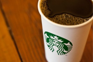
Starbucks rebranded and, as if on cue, the blogosphere, Twitter-drome, and various other corners of the Internet burst alive with the bright comments and fiery perspectives we’ve come to expect, all of which relate to one certainty: brands are incredibly powerful! And when we talk of elite brands, Starbuck’s mermaid now finds herself in the rarefied pantheon of logos such as Nike’s Swoosh and Target’s Bull’s-Eye that stand alone without words or letters.
And Starbucks can certainly get away with it: the new logo works because they’re the store at every corner. But being an established company doesn’t mean you can get away with whatever you want when it comes to updating your logo. The recent Gap debacle shows how the simple notion of rebranding can become an emotionally charged debate, a testament of how seriously we take the connection to brands that define us.
And it seems as though Starbucks took the lesson to heart. Gap’s short-lived logo was obviously too radical for its most ardent fans, but then again, the modern font paired with the floating blue square on a white background bore little resemblance to the clothing brand’s standing logo – not to mention it’s corporate iciness. Starbucks essentially kept their old logo, scrubbed off the coffee chain’s name and brightened their distinct green for an overall successful image that aims to take on a wider world – a world that doesn’t embrace American (or at least English-speakers’) brands as readily as it once might have.
The emphasis, then, is on how utterly established Starbucks is these days. This is why it works. And for the most part, the online pundits accept the new Starbucks logo, even if most of them are too cool to drink the company’s product. But did we forget that Starbucks is in the coffee business? Perhaps that’s exactly what this new logo wants us to do – while at the same time, offering more.


