The World Wide Web of Red
Last week we talked about the psychology behind the color red, and how it has been proven to actually increase your blood pressure, heart rate and appetite. Red can be associated with passion, adventure, and violence, which explains why many of the following websites chose to feature it in their color palette. But is color alone enough to convey your message and create a site that’s easy to navigate? Let’s take a look at some red websites and see whether or not their use of color affects their usability.
CHROME BAGS
Chrome is a company that makes high quality messenger bags and other apparel, most of which features their famous red seat-belt closure.
Here is their Design Manifesto (from their website):
Chrome’s design is born of utility and purpose. We’re anti-nonsense. Everything we make is functional. Every piece of our bags, shoes and clothes is there for a reason. If it doesn’t have a purpose, it’s gone.
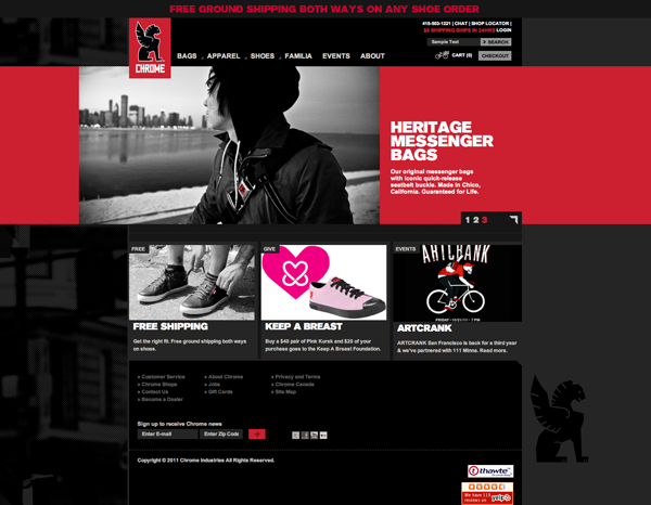
Given this strong design sensibility, it makes sense that Chrome’s website is gorgeous and usable. The color palette is sleek and grayscale, with their trademark red highlighted in the logo and working well as an accent color. The strong red banner communicates the mood of the brand and educates the user about the company. Bright red calls to action highlight special offers like free shipping, and a clean grid keeps the rest of the information organized. The navigation is easy to find and use, and turns red when hovered over.
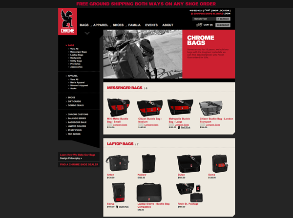
On their product page, there is a lot of information, but it is clearly organized. On this page red plays a similar role, acting as bread crumbs to let you know where you are on the site and highlighting product names and categories.
www.chromebagsstore.com/
USABILITY SCORE: 5/5
GORILLA COFFEE
We were initially excited when we found this visually striking website for a Brooklyn based coffee shop, but it soon proved to be slow and hard to navigate.
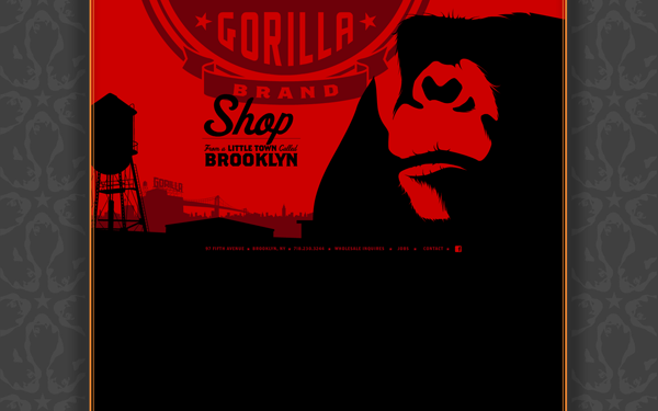
The website is flash based, which immediately raises red flags. This means long load times and clumsy navigation. From the home page, we were unsure where to go next. The bright red background is a little much on the eyes, and their logo almost gets lost, especially in juxtaposition with the giant black gorilla. The only clear call to action is the word shop, so that’s where we chose to click (though who wants to shop if they even know what they’re shopping for?!). The home page doesn’t even say the word coffee once!
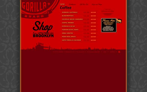
The shop is overwhelmingly red, with the yellow and red types of Coffee bordering on illegibility. The buy now buttons are lost, as they are the same color as the background. This site would have been much more effective if the background was a different color and the red was saved for the accents. At this point we’re starting to get annoyed by the flash based navigation, so we try to find out more about the company by clicking “From A Little Town Called Brooklyn”, figuring that might lead to some sort of about page.
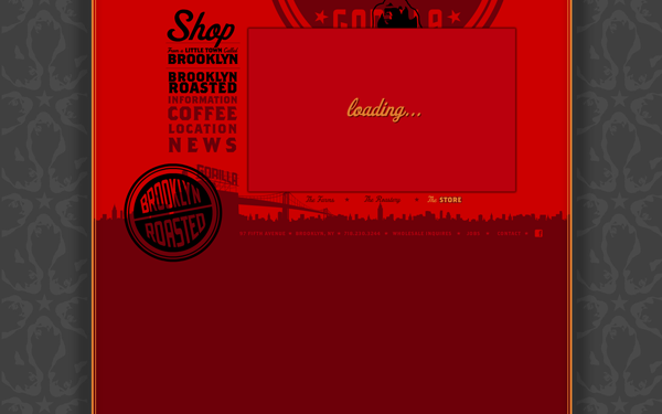
And it does, sort of. It leads to a menu of more vaguely worded links that eventually give you some information about the company. Once you make it past the loading screen. However, we have a feeling that the average user would have already clicked the back button.
www.gorillacoffee.com/
USABILITY SCORE: 2/5
TAAMI BERRY
Our last usability review is for a site advertising and selling something called a táami berry. According to the site “the táami berry is a small miracle fruit that has the power to flip our perception of flavors, making sour and bitter flavors taste extremely sweet and delicious.” Their target audience seems to be health and beauty conscious women, which would explain the feminine color palette.
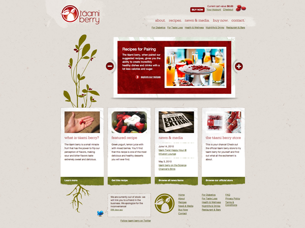
This earthy chic site uses a scarlet shade in a unique way. Most of the red sites that I saw paired the color against stark black and white, but táami berry uses beige and olive green to create a much softer, but still very elegant feel. The berries themselves are red, and this color turns up again in the logo, slider, navigation, and calls to action.
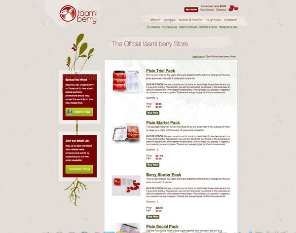
The e-commerce page is clearly organized, with the complimentary olive green defining important information in a more subtle way, with the red highlighting specifics such as price. The company appears to be on a hiatus (all of the products are out of stock). So maybe they don’t get points for dynamic content, but they definitely rock a solid design and information architecture.
www.taamiberry.com
USABILITY SCORE: 4/5
MORE RED WEBSITES
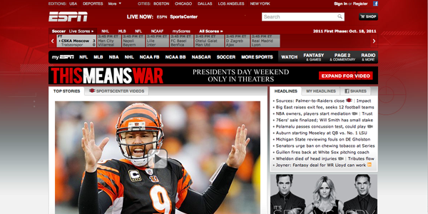
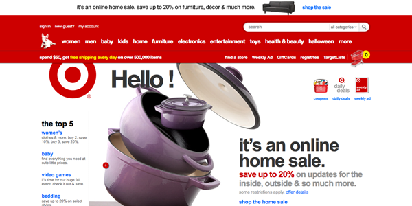
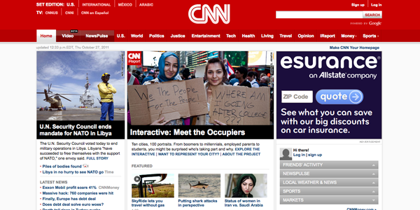
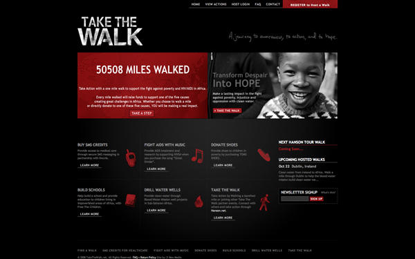
Here are some more dynamic red websites for your inspiration. Why not try doing your own usability review?
Do you think that red is used effectively in these websites? Are you feeling hungry, thirsty, excited, agitated, or passionate?
We’re feeling pretty passionate (about usability).
Follow us on Twitter (@StudioKandM) for usability tips, design inspiration, and interesting news from around the web.
This is the second in a series of posts about color theory and design inspiration. What’s up next? Red packaging and print design.


