24kt Web Design: Yellow and Usability
Yellow is a surprisingly popular color in web design. Visually striking and vibrant, this cheerful hue contrasts nicely with black, making it an ideal accent color. It is associated with happiness and intelligence, and is loaded with energy. Yellow calls the user to action, which might be why it is found on many non profit and charity sites. As with all good things, yellow should definitely be used in moderation as too much of it can be overwhelming. Let’s take a look at some yellow websites and see how they rate for usability.
FontShop
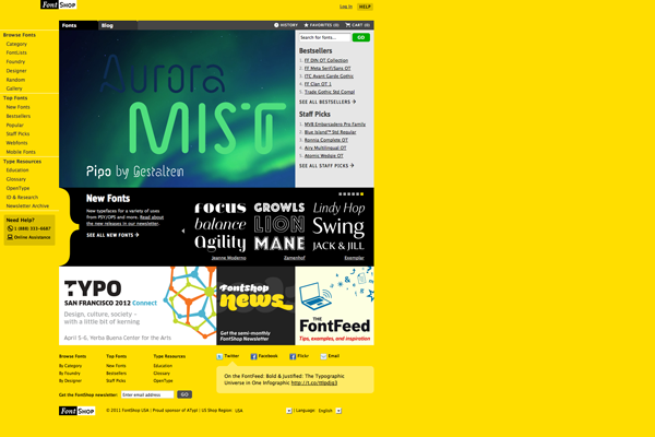
As every designer knows, it can be tough to create a unifying brand when you have to integrate graphics containing a variety of typefaces. FontShop.com uses a bold yellow hue to create consistency across all of their pages. Though they do a fairly good job of organizing a lot of information and conflicting visual languages into a clean website, there are still some usability flaws.
As we just mentioned, there is a LOT of information on this site. They have an expansive collection of typefaces, and their navigation allows you to sort through the various categories. It makes sense that they would list these parameters in a vertical bar on the left, as there are too many for a traditional horizontal navigation. On the right they have various featured fonts, both as large banners, a smaller sliding collection, and lists by categories. Though we understand their reluctance to display too many typefaces on the same page, there is no incentive to click on the list of “Best Sellers” or “Staff Picks” as the user has no way of telling what these typefaces look like. It would have been nice to be provided with some sort of preview of these typefaces on the home page.
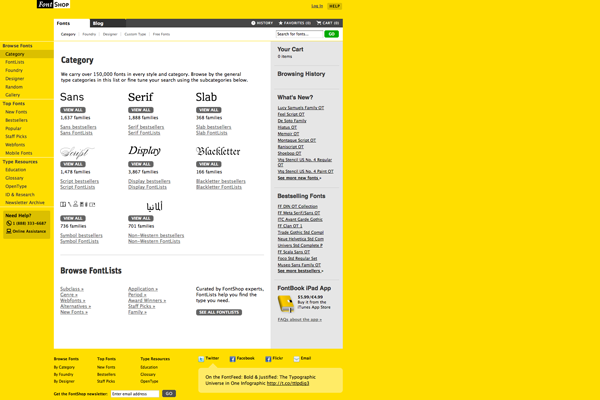
Of all of the ways to browse the site, the most user friendly option is to browse by category. When you navigate to this page all of the categories are listed, and their names are reinforced with visual cues (the name is displayed in that type of font). Though most designers will know the difference between a serif and sans serif, this is incredibly helpful for novice users.
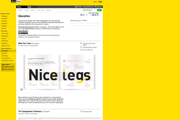
Another great tool for beginners is their education section, where they have a collection of PDFs available for you to download for free. Both previewing and downloading these beautifully designed files prove to be user friendly tasks (though the PDF’s should open as a download prompt as opposed to in a new window). We just wish that this very helpful and unique feature was featured more prominently on the homepage.
Usability Score: 3/5
www.fontshop.com
SXSW Beer Camp 2011
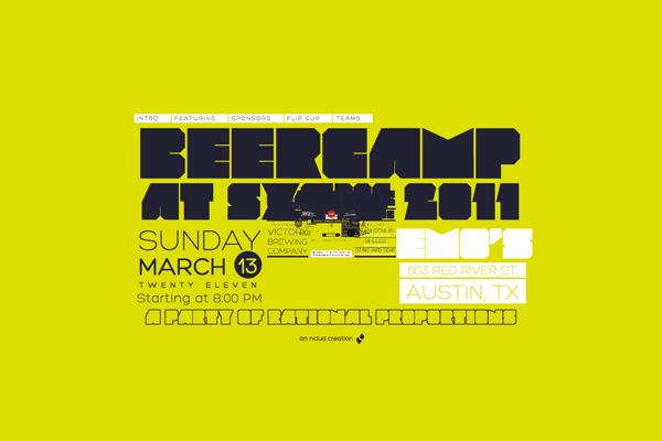
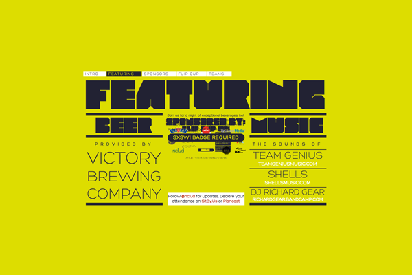
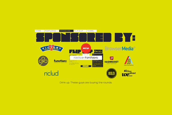
Though the SXSW Beer Camp 2011 homepage also features the color yellow and some interesting typography, it is on the opposite side of the usability spectrum. This site uses a barely legible family of typefaces for its logo and some of the copy, and the navigation is quite confusing! By scrolling down the page the user actually scrolls through the site, revealing the next page through a window in the middle of the page.
Of course the user could also choose to navigate in a more traditional sense by using the links at the top of the page. Either way, the design of the site is incredibly confusing. It is very distracting to see the content of the next page in the middle of the design, and the user has no idea what to focus on. Though they must have chosen this particular shade of yellow to reference the color of beer, we find it incredibly overwhelming and frankly, unappetizing. We understand that the site for a music and beer festival should be quirky and fun, but that is no excuse for bad design.
Usability Score: 0/5
2011.beercamp.com
Livestrong
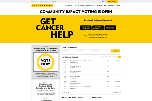
Livestrong.org is the official website for the Lance Armstrong Foundation. At a first glance, this site is incredibly user friendly and features a clean and contemporary design. The site has two main purposes, one of which is to get users to take action in the fight against Cancer (by donating or attending an event), the other is to educate users about the disease and provide support. The design does a good job of promoting both of these goals without overwhelming the user, and implements clear navigation and calls to action.
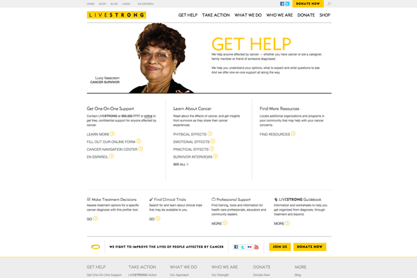
The design of the “Get Help” page is elegant and minimal. Though the site offers a variety of resources to patients, these resources are nicely organized into three different categories. The large yellow title tells you exactly where you are, and the photograph is hopeful and realistic. We just wish that the labels on the actual page corresponded with the labels in the drop down navigation.
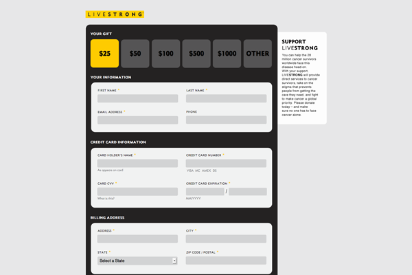
Clicking the “Donate Now” button takes the user to the donation form, which is beautifully designed and usable. You can easily select your donation amount or enter in a custom value. All of the information is entered in on the same page (as opposed to many check out processes which seem to never end). However, if you decide that you don’t want to donate, I was surprised to find that the logo does not link back to the homepage. You can always click the back button, but I couldn’t help feeling a little pressure to stay on the page. This is a clever marketing tactic, but it doesn’t bode well for usability.
Usability Score: 4/5
www.livestrong.org
More Yellow Websites
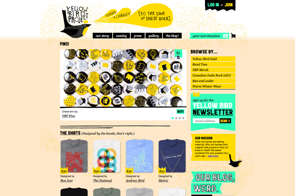
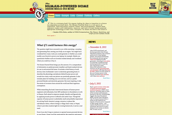
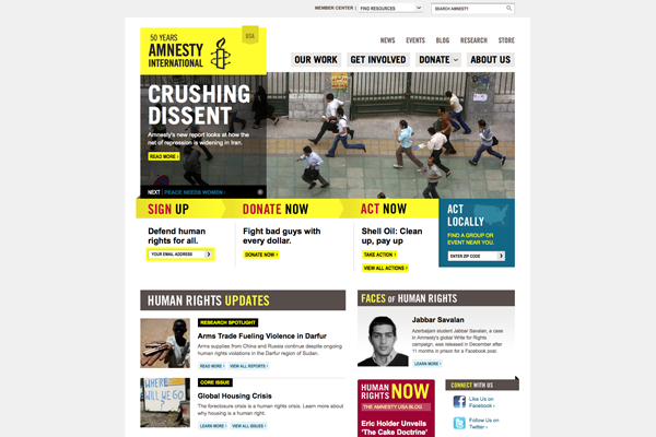
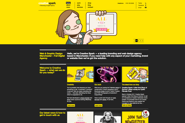
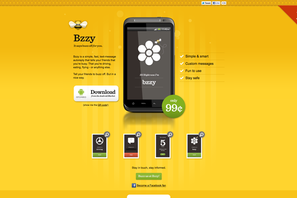
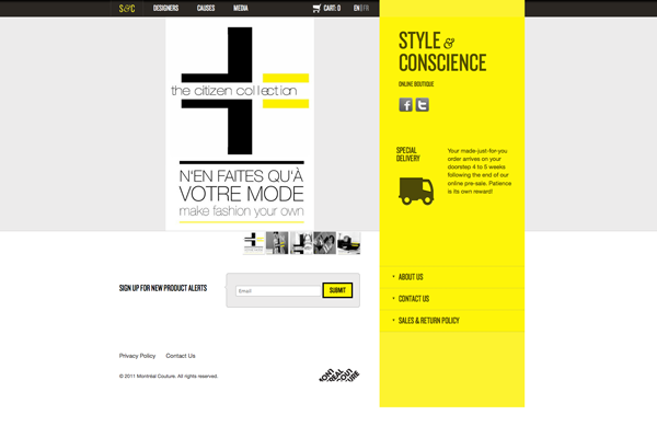
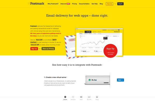
Here are some more cheerful yellow websites for your inspiration. Why not try your own usability review?
Do you think yellow was used effectively in these sites? Did these colors spark your interest?
Follow us on Twitter (@StudioKandM) for usability tips, design inspiration, and interesting news from around the web.
This is the second in a series of posts about yellow color theory and design inspiration. Up next: yellow print design and packaging.


